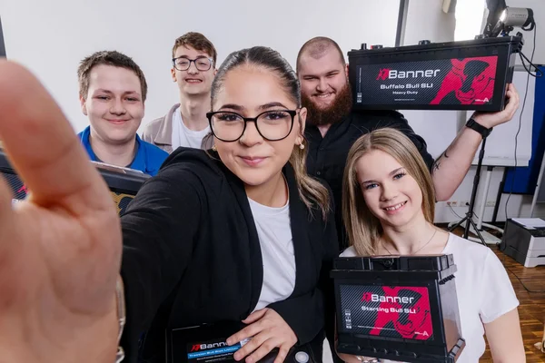
“At a time when markets, technologies and expectations are changing rapidly, companies need a clear identity more than ever,” says Martina Fuchs-Auer, MBA, Head of Marketing Communications, who is responsible for the relaunch. “A strong brand identity provides direction, builds trust and makes progress visible. This is particularly true when it goes beyond superficial changes and reflects genuine development.”
This is precisely the path Banner Batterien is taking. After around two decades with the same visual identity, the time was ripe for a relaunch. New business areas such as stationary storage solutions, new technologies such as lithium, and extensive investment in digital systems call for an identity that makes the company’s future-proofing visually tangible. The relaunch is therefore far more than a design project – it is a visible sign of Banner’s next step in development.
More than just a new logo
This is particularly evident in the new logo. The bull remains at the heart of the brand and stands for energy, determination and dynamism. At the same time, the lines, typography and colour scheme have been refined so that Banner makes just as strong an impression on websites, in apps, on social media and in digital applications as it does on products and packaging. With the slogan #sparkthedifference, Banner underlines its ambition not merely to keep up, but to be noticeably different and visibly better.
Managing Director Mag. Werner Töpfl emphasises: “We remain the reliable partner at our customers’ side, but present ourselves with a fresher look that underlines our commitment to innovation and responsibility.” This is precisely where the strength of this relaunch lies: it preserves the familiar whilst making room for the new. The Austrian heritage, the European ambition and the technological expertise remain clearly recognisable – just in a form that is more firmly rooted in the present.
Values that have an impact both internally and externally
It is particularly noteworthy that the new brand identity does not merely have an external impact. It also provides a cultural impetus internally. With the four clearly defined values of proximity, reliability, foresight and performance, Banner articulates what the brand stands for today – and by what standards it wishes to be measured tomorrow. This strengthens identification within the company whilst simultaneously creating a consistent perception across all channels: from sales and trade fair appearances to POS materials, the website and the digital ecosystem.
In this way, the relaunch becomes something that goes far beyond design. It shows how a long-established company does not leave its history behind, but consciously builds on it. The bull remains the bull – but it presents itself with new clarity.
#genius when a brand relaunch not only shows what a company looks like, but also what it stands for.